in the news (145)


WHAT'S IN YOUR LOCKER?
7 photo(s)

november 2016 | by linda repplinger

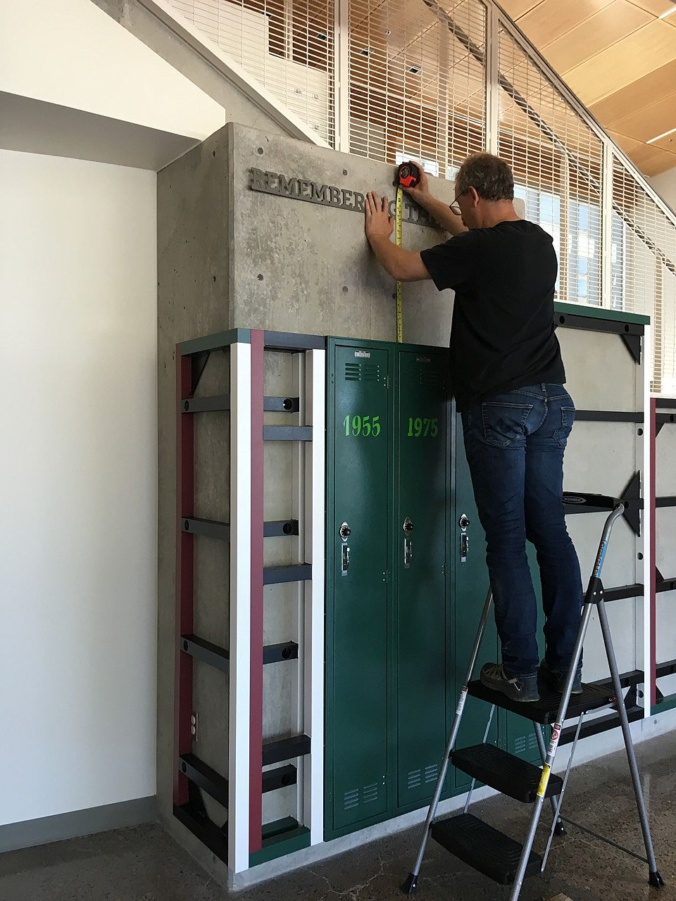
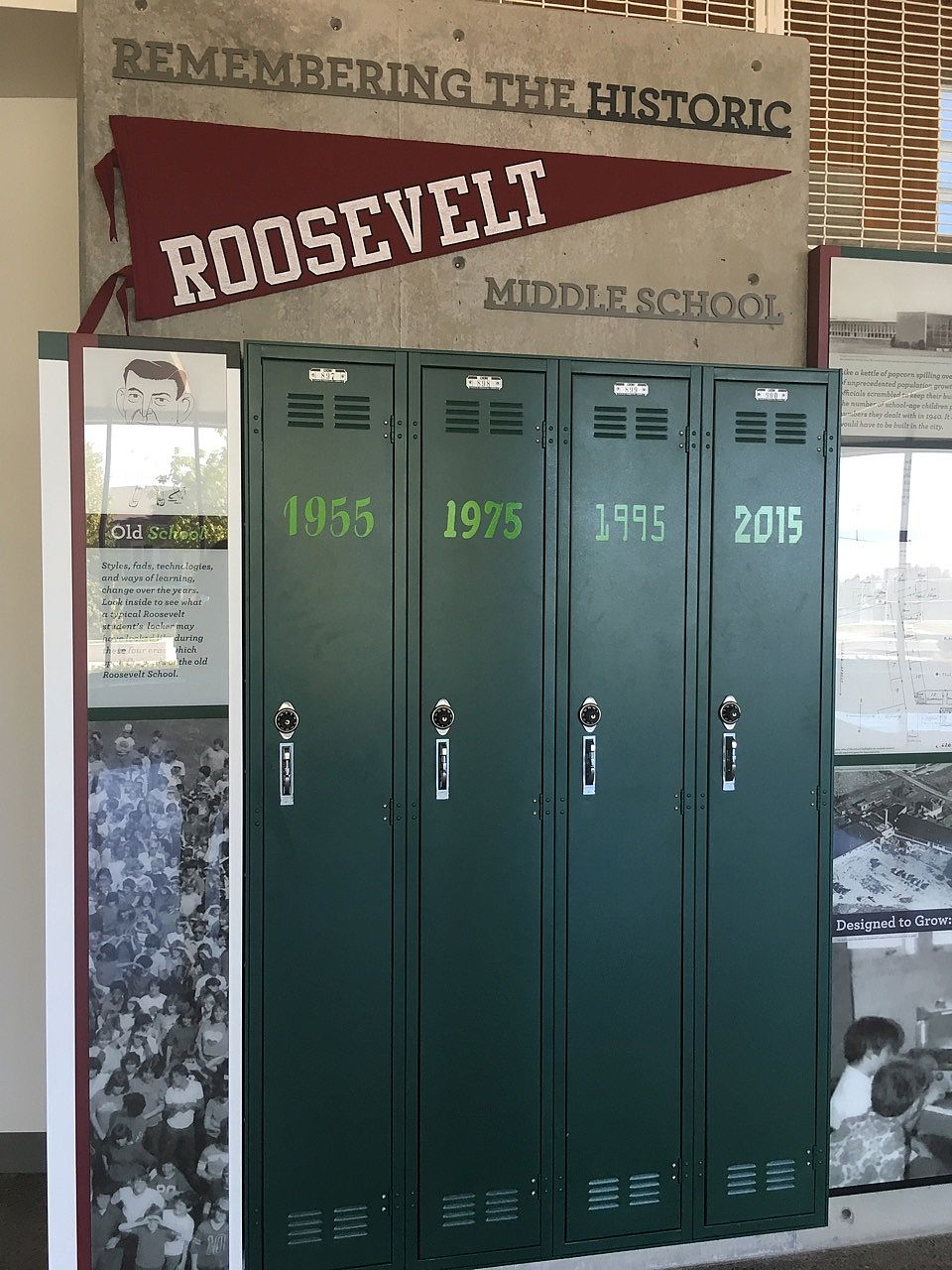
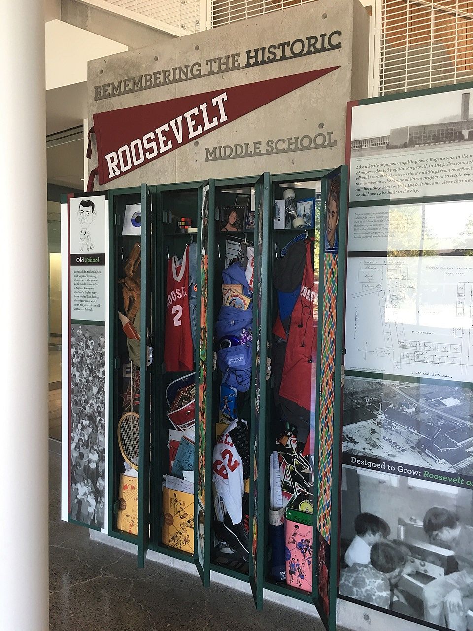
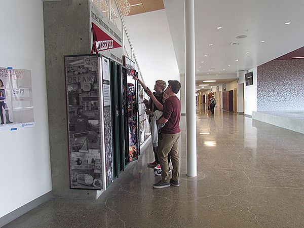
Eugene, Oregon recently replaced an outgrown middle school with a brand new facility. The old Roosevelt Middle school—a rambling single-level building, originating in the 1950s—was adapted over several decades as population and needs expanded. Sea Reach was challenged to create commemorative exhibits of the old school to be placed in the new school.

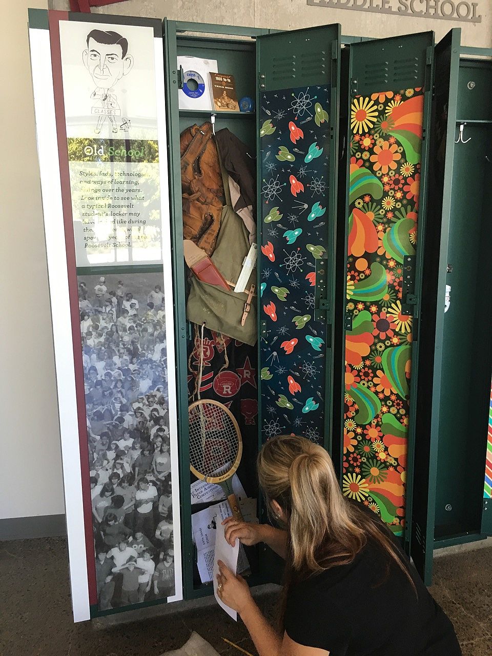
As part of these exhibits, we retrofitted the old school’s lockers as snapshots in time: 1950s, 1970s, 1990s, 2010s. We started off with cleaning out our attics and closets, which produced a lot of items from the 90s and a few from the 70s: walkmans, cassette tapes, floppy disks, and a troll doll. One of our teammates brought in a stack of funny illustrated short stories and old school papers. Homework assignments were downloaded from the internet and passed around the office to be completed (stuff we learned and possibly forgot a long time ago!). The rest of the items were hunted down on eBay. We focused on subjects that could be compared to each other, such as a slide rule, calculator, graphic calculator, and an iPad.

After everything was collected, it needed to be artistically crammed into the 5" deep retrofitted lockers behind a piece of acrylic. It required a two-person team and a bit of flexibility to tuck in papers, trapper keepers, and a skateboard (which had already taken a quick run down the new school hallway), and other memorabilia. It was all placed behind a clear sheet of acrylic.

With the locker doors closed and primed with surprises, the exhibits stood ready for students to discover as they explore their new school and remember the old one.

99% CHANCE OF RAIN
3 photo(s)

october 2016 | by leia reedijk

We knew some of the sites along the Rock Creek Trail in Hillsboro, Oregon could pose challenging for our installation of wayfinding signage. The area floods regularly and the trail is completely under water for parts of the year. Because of that, I was anxious to get all our 51 signs in before Oregon’s notorious rain started and the sites became inaccessible.

I woke up the morning of our install to find that the forecast predicted a 99% chance of rain. Oh boy... We went out into the field, hoping the meteorologists were very wrong.

There are always challenges on an install. Maybe you discover there is a sewer main exactly where the client wanted a sign, or your adhesive suddenly won’t adhere. After a few installs, you quickly learn there is a solution to every problem. For this installation, there were plenty of challenges.

First, it started to rain. Then, the truck started having problems. Then, we realized we didn’t have a tool we needed. And then, it started really raining hard. That’s when it started to feel like the universe was plotting against us—and the install was never going to be finished! It is at these critical moments when the team has to persevere and rely on each other (because, of course, the install has to get finished).

That’s what we did. We moved methodically and took one site at a time. The rain pelted down, but we focused on the hole we were digging, the sign we were leveling, the batch of concrete we were mixing. Our clothes were soaked through, but every team member knew their task so we could work as efficiently as possible. By the end of the third day, our boots were full of water. We were all happy to be done—and we finished in half the time I had expected.

Three days later, I returned to the first site to take some photos. It had all turned out well. The signs looked great and I knew the client would be happy. The sunlight was streaming through the trees and the sky was clear. I wished we had postponed our install. Just as the thought ran through my head, I rounded a bend in the trail to find a small lake where the path should be. Three of our signs were already partly submerged. It seems we installed just in time.

FROM CONCEPT TO CREATION
5 photo(s)

october 2016 | by melissa boettcher

In the past few months we have been working on concepts for a visitor center in Texas. One of the concepts was to show leaf cutter ants climbing up the wall to a tree canopy and collecting leaves. The kick is: the ants increase in size from actual to giant.

We will now explore taking a concept into reality. In this case we will take a picture of a leaf cutter ant and turn it into a 3d object of an ant.

A few things need to be considered when taking an idea into reality:
How realistic do we want the ants to look?
How easy it is to put multiple copies together in multiple sizes? Will it be sent out or are we building these ants in-house?
What kind of materials should we use?

After some research we decided to move forward with our own version of a balsa wood ant. Looking at several photographs of a leaf cutter ant at various angles (top, side, underneath, front facing) we broke down the single planes of one ant. Using the "balsa wood dinosaur" concept we rebuilt the ant using the crossing planes, forming a new 3d ant. Prototypes were built to discover areas of issue in connection of the planes and to see the overall look in comparison with the real ant. After we completed the final design, we were ready to fabricate.

The ants were built in house, in four different sizes, from small to large. We used the design to cut the pieces out of acrylic using a CNC router table. Every piece, 25 pieces per ant, had to be assembled and glued together. We ended up with 38 ants in total. How many pieces was that in total? You do the math!

LETTING ALEX SAFELY ENGRAVE, RESPONSIBLY
2 photo(s)

september 2016 | by alex ogle

Pew pew! Guess what’s new: we’re firing our lasers over here at Sea Reach. Peter recently got a 5.5W laser engraver, and I had the pleasure of putting it together and testing it out. Curious about the strength of the laser, I ran a few calculations and discovered that if you were to look directly at the laser beam it is a little more than 2 trillion times worse than looking directly at the sun (yikes!) So first things first: no one gets near this without safety goggles!

Besides having to MacGyver a few of the electrical connections to the motors (our kit came with the wrong connectors), the mechanical and electrical build of the engraver went smoothly. Calibration is where the fun and the challenge lies. To determine their suitability for engraving, we ran tests on the variety of materials that Sea Reach has in its shop, including wood, plastic, painted aluminum plates, and even clear acrylic.

With our safety goggles and a little tinkering, we’re now able to etch our designs into whatever can be burnt…experiment #1: Cory’s lunch. Now no one will eat Cory’s carrots!

SNORKELING FOR FOSSILS
2 photo(s)

august 2016 | by cory schott | show project

It’s the hottest day of the year, but I’m shivering. I’ve just emerged from the Yamhill River, wet and muddy. As I stand in the sun trying to warm up, I spot two bleached ribs from a deer slowly dissolving in the slightly alkaline water. I was told they would be there. However, as my eyes scan the 3 inches of water I see a familiar shape. It’s also a bone, sort of like the shape the makers of dog treats try to make their products, but it’s one that is thousands of years old.

We get to meet all sorts of interesting people in the course of our work. For over a decade, Sea Reach has worked with the City of Tualatin, Oregon to plan, design, and fabricate exhibits that interpret the area’s Ice Age past. During this time we’ve teamed up with a number of experts to ensure that our materials incorporate the latest research and are historically and scientifically accurate.

One such expert that we’ve relied upon is Mike Full, Willamette Valley Pleistocene Project Founder. When our most recent project (Tualatin ArtWalk Extension) wrapped up, Mike graciously offered to take Linda (our senior designer) and myself on a fossil-hunting expedition along the Yamhill River.

It was there—only a few miles from my house—that I found a metacarpal of a Bison antiquus calf. The bison antiquus, the ancestor of the bison, was massive, weighing around 3500 pounds when fully grown.

We found several other fossils that day, including ivory, part of a mastodon or mammoth jaw, and a piece of a skull (not sure of what yet!). Each piece we found became part of the Willamette Valley Pleistocene Project’s collection. GPS coordinates, extensive photo documentation of the fossil in situ, and other metadata was collected before we took it out. When the fossils are stabilized, Mike and his team will follow-up the field identification with a more thorough evaluation.

It was an experience of a lifetime and I know both Linda and I are excited to try it again!

LEFT BRAIN VS. RIGHT BRAIN
1 photo(s)

july 2016 | by kent puntenney

By now most of us have heard about how creative people are "right brain" and logic loving people are "left brain". Recently, though, scientists from the University of Utah studied 1,000 participants’ brains in 7,000 different activities. Surprisingly, the study found no evidence supporting the idea that people preferentially use one side of the brain more than another. Both sides of the brain are equally engaged.

Are left or right brain exercises worthless? Not so.

In a 2012 study published by the American Psychological Association, German scientists found that athletes were less likely to choke under pressure by clenching a ball in their left hand before a race. Their theory was that by clenching the left hand, the right brain became more active and allows the athletes to trust in their trained muscle memory.

This has broader implications. It is thought that the elderly sometimes fall because they are overly focused on maintaining their balance. By clenching their left fist and engaging their right brain, the elderly may find improvement in walking and climbing stairs.

So what does this have to do with an interpretive design and fabrication company?

If, as the above research suggests, the two sides of the brain are different, but equally important, it suggests that the best interpretive materials might be ones that, like clenching the left fist, boost the activity of the opposite hemisphere and enable the brain to engage more fully in the experience.

What would that look like? An exhibit mounted sideways so viewers have to lean to the left to read it? A patterned border that engages the spatial skills of the right brain in support of the left brain’s understanding of the written message? We don’t know, but we’re fascinated to think about how this brain-research frontier can apply to our work.

And maybe some of us will be squeezing rubber balls in one hand or another when faced with a challenging task!

THE GRID
0 layout(s)

july 2016 | by leia reedijk

It is one of the most basic principles of design — the grid. Designing on a grid makes information accessible to the user, helps organize and create a hierarchy of information, and above all is pleasing to the human eye. It is all about balance, ratio, and rhythm. However, as Pablo Picasso said, "Know the rules like a pro, so you can break them like an artist."

The sign package that Sea Reach developed for the San Juan Preservation Trust is all about breaking the grid. Instead of locking the text and images into a rigid structure, these layouts are all about the elements’ relationships to each other. Building from one point, so that each element references the others, creates a different kind of movement and flow within the design. The splashes of color and images across the panels are reminiscent of the scattering of islands in the Salish Sea that make up the San Juan Archipelago. The text, woven among images, contrasts the geometric and organic. What at first glance seems random has an overarching harmony based on counterbalance and context.

JOINING THE TEAM
0 layout(s)

june 2016 | by jacob cordova-krahn

Joining the team at Sea Reach has been an exciting experience! I am learning new print production skills, creating conceptual designs for visitor centers, and making artwork for exhibit panels. Two of my first projects have been producing exhibit designs for the historic U.S. Custom House in Astoria, Oregon and creating conceptual designs for McKinney Falls State Park near Austin, Texas.

It's been a joy to utilize my propensity for illustration on the Astoria project. For one of the exhibits I got to create an imaginative scene of the interior of the Custom House set way back in 1849! The scene is filled with a few colorful characters and objects relevant to the time period. I enjoyed learning about the history of Astoria and the Custom House—the first U.S. customs office on the West Coast. I also found researching and working with historic photos to be eye-opening, greatly enhancing my appreciation for Oregon history.

For McKinney State Park, I worked with the rest of the Sea Reach team to create concepts for a complete redesign of the visitor center there. It was great to collaborate with other talented designers to push our imaginations to their limits, coming up with some very fun and interactive ideas. One of my favorites is the giant interactive map that leads a viewer through the "El Camino Real," highlighting the experiences of different types of characters you'd expect to find on the path during the 18th and early 19th centuries.

I'm excited to see these projects come to fruition and to be a part of the team at Sea Reach!

PRIESTS AND PRESIDIOS: A SPANISH TEXAS CRASH COURSE
0 layout(s)

june 2016 | by cory schott

Sea Reach is developing designs for two visitor centers in Texas. Since both of these projects involve the interpretation of the region when it was a colony of Spain, I was tasked with bringing everyone up to speed on the colonial history of Texas. I graduated in colonial Mexican (and Texas) studies, so this was right up my alley.

Because I work with a visual people, I crafted a presentation that focused heavily on a few key narratives and dazzled them with imagery and textures. Broad swaths of political history were eschewed in favor of illustrative examples. Colorful period maps, carved stone facades, iron implements, and fanciful details from colonial documents let the flavor of the period sink in.

In the end, two concepts seemed particularly important for our purposes. The first is that Texas truly was on the edge of Spain’s empire—just barely connected to the administrative centers in Spain and Mexico City. This sometimes allowed for more fluidity in frontier society. The other is the role of the environment played in the placement of towns, presidios, and missions. In this arid part of the world, development and travel needed to be carefully considered.

WORTH A VOYAGE
1 photo(s)

june 2016 | by linda repplinger

I just returned from attending a workshop at the National Park Service headquarters in Harpers Ferry, West Virginia, for three national firms (of which Sea Reach is one) that recently earned an indefinite delivery/indefinite quantity contract to create wayside exhibits in national parks and historic sites.

The trip was abundant with charming experiences. The narrow roads of Harpers Ferry wind down steep hillsides and are closely lined with tall rustic buildings, dating back to the early 1800s. We stayed in an old stone inn, tucked into a nook in the valley’s rocky edge. The next day started with a walk up the Appalachian Trail to Jefferson’s Rock to watch the sun rise over the confluence of the Shenandoah and Potomac Rivers—the scent of damp stone and honeysuckle vines mingled with the call of cardinals. As the sun rose, it highlighted individual trees along the dark sides of the valley. Thomas Jefferson wrote of this view:

"The passage of the Patowmac [Potomac] through the Blue Ridge is perhaps one of the most stupendous scenes in Nature. You stand on a very high point of land. On your right comes up the Shenandoah, having ranged along the foot of the mountain a hundred miles to seek a vent. On your left approaches the Potomac [Potomac] in quest of a passage also. In the moment of their junction they rush together against the mountain, rend it asunder and pass off to the sea.… This scene is worth a voyage across the Atlantic."

Jefferson’s rock was smattered with the names of many others who also felt compelled to commemorate their presence here.

With a nod to the design department at Harpers Ferry, who emphasized honing the interpretation of waysides down to the simplicity, intensity, and direct expression of a subject, I sum up this experience with a haiku.

confluence of time
many feet have traveled through
some have just begun

left left
showing
left left