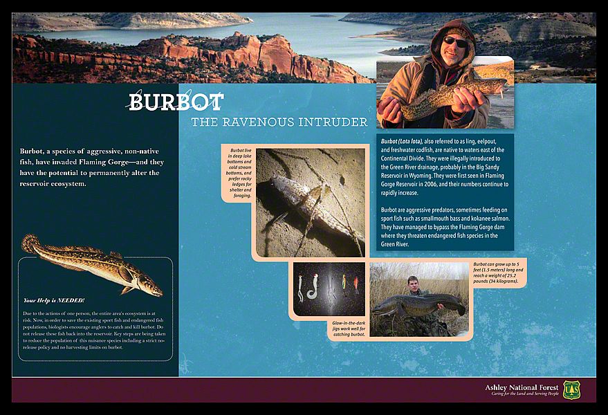
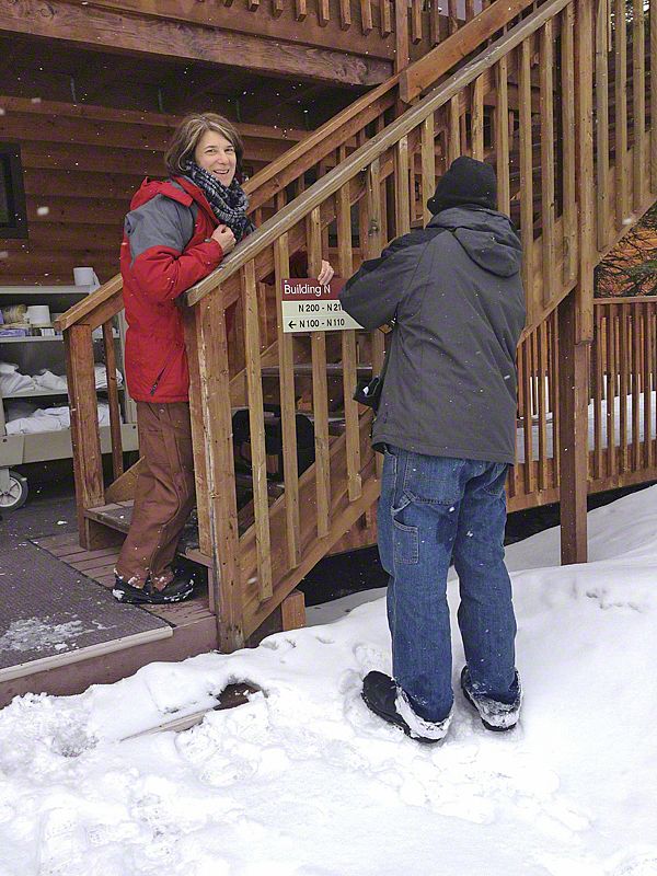
in the news (145)


A BUILDING WITHOUT A VIEW...
9 photo(s)

august 2013 | by peter reedijk | show project

As part of the redesign of the Powell Butte Visitor Center a small window was designated in the eastern wall of the building for a special purpose. The idea was that the carefully placed frame would capture the iconic image of Mt. Hood, visible most of the time from the elevated butte. There was only one problem: Mt. Hood is NOT the water source for the 50 million gallon reservoir on the butte! A common misperception that the Water Bureau was trying to erase.

The solution: get rid of the window and find a way to show the real source of the gravitation fed water system - Bull Run. The new design concept was to create a sprawling mural with the help of local artist, Larry Eifert, that would display the entire water system. Last week, we installed the result of this effort. Now, inside the new Visitor Center, which is close to being finished, a stunning mural fills the eastern wall - floor to ceiling, wall to wall.

NATURE TRANSLATED
15 photo(s)

august 2013 | by peter reedijk | show project

Working with artist Mark Andrew, Sea Reach is incorporating a series of bronze reliefs featuring signature species of the four habitats at Powell Butte Nature Park.

The process began by communicating with Mark via photographs what we wanted the bronzes to depict. Through skilled handwork and the eye of the artist, Mark created four sculptures that are featured on top of habitat bollards placed along the loop trail. The bollards provide a glimpse into the different habitats that can be experienced on walks on the butte.

Follow the photo series and see how the sculptures come alive.

HUCK FINN
0 layout(s)

july 2013 | by nicole adsit

One of the best things about designing interpretive panels (maybe THE best thing) is reading and absorbing the messages for each site. Flaming Gorge was definitely one of my favorites. The history of this place reads like a Huck Finn story; adventure and danger, limited means, and absolutely NO knowledge of what lies ahead! Not only does it have a rich history and beautiful landscape, it has some of the best geologic features in the area!

Taking all of this in, I wanted to design something showcasing the stunning landscape and rich history. Texture was used to convey age, banners were placed at the top so each panel exhibited a strong image of the site they would be placed at, and the colors were pulled from the area: deep, bold and vibrant.

INTAGLIO PAINTING
10 photo(s)

july 2013 | by megan whitaker

In short: a sign with a colored background with a raised graphics. The key to success is an involved process with carefull planning between the painter and artist.

Before any lettering is laid down, I make measurement and spacing decisions. 
I check with our painter to clarify which paint he intends to paint first, no sense putting any lettering down if he doesn't have paint in the queue as I have a small window of time before it is impossible to cleanly pull off the lettering. Lettering is applied after each coat of paint until the final coat and then all lettering is pulled off and topped with a gloss coat. It is here that perhaps the secondary meaning of the word intaglio is the best description - A gem with an incised design.

FIELD EXPERIENCE
2 photo(s)
0 layout(s)

june 2013 | by ben speidel | show project

One of the truly great things about working at Sea Reach is getting to install our exhibits. We encourage and make room in our busy schedules for all staff members to get out into the field to experience what we do and to see where our art exists in the world. I hadn't grasped the power of this myself until very recently.

As the general manager and a new father, I was not enthusiastic about leaving my post - my inbox is always full, there is a steady stream of calls, and a shop full of fabricators needing materials. On top of it all, for those who have raised a little one, you know that your partner needs all the help you can give. Funny how all of these reasons seemed to disappear when my boss smiled and said, "you're going."

I was sent off to Multnomah Falls to do a "simple" exhibit panel replacement. I've seen the instructions countless times on how to do the process:

Step 1.
punch and drill out the existing rivets.

Step 2.
remove rail and slide in new panel.

Step 3.
hammer in new rivets.

I didn't master Step 1 until rivet number 14. There were 15 rivets. Rivet 15? Perfectly executed! I can now describe to a client fourteen ways to fail at removing a rivet and the one way to it successfully!

When all was said and done, I'm certain this was the lesson I was to learn. Whatever frustration I experienced that day, paled in comparison to the beauty of the falls and the memories it brought back. My wife and I traveled to the falls early in our relationship and as I looked up it struck me how lucky I am both personally and professionally.

THE (NOT SO SWEET) SMELL OF SUCCESS
8 photo(s)

june 2013 | by ben speidel

We are just finishing installing signs at Metro Central and South Garbage Transfer Stations. This a collaborative effort combining the talent of Metro's sign plan and designs with Traffic Safety Supply's expertise producing retro-reflective signs and Sea Reach's "can-do approach" - retrofitting existing bases, assembling impact resistant posts, fabricating parts, and installing.

Our first days on site were a bit overwhelming - the constant stream of cars, trailers, and trucks, the volume of trash being processed, and the smell of "organics," - but all taken in stride by the incredibly polite staff running this place.

At the end of the day I can happily say that Metro, Traffic Safety Supply, and Sea Reach improved the overall appearance and functionality of the sites but we had zero impact on the "organics."

DIRECTIONS IN THE WILDERNESS
25 photo(s)

may 2013 | by peter reedijk | show project

Temperatures below freezing, snow up to our thighs, bone-chilling winds, and fifteen dark buildings greeted us as we rolled into the Denali Princess Wilderness Lodge campus. Even though it was May, record low temperatures had kept the lovely site locked in a winter deep freeze. With a team of four, we were prepared for the worst, but when it hits you in the face, you wonder if maybe you should have packed one more layer of clothing.

Our next ten days would be spent installing 665 room signs, 21 building signs, 120 pedestrian directionals, and map kiosks. We would tread across the frozen landscape, peel layers of clothing as the sun warmed the air, and eat... and eat (there's something about cold weather that gives you a voracious appetite).

Installation in the bitter cold has its own challenges. Because most adhesives need room-temperature conditions to cure - and conditions at our installation sites were far from room-temperature - we had to redesign our installation method on the fly. We began by conducting a series of "cure" tests. The first were done in optimal conditions, with tools, materials, and adhesives at at least 60 degrees for eight hours before subjecting them to the outdoors. Next we tested them in less than desirable (but more realistic) conditions: materials and adhesives placed outside for six hours and then adhered and "cured" in below-freezing temperatures for another 24 hours.

The results: our caulk-based construction adhesives (which turned into solid cylindrical bricks when left outside) needed indoor temperatures to cure successfully. But specialty acrylic adhesive tapes cured outdoors, even in freezing temperatures - a pleasant surprise, and a good solution to a big challenge.

WALKING A TRAIL OF MEMORIES
0 layout(s)

april 2013 | by melissa boettcher

Working with our client at Franklin Creek Natural Area in Illinois, I was entranced by his vivid descriptions of his experiences walking the trail at different seasons. "Coyotes work the edges of habitats, I have seen them several times leaping out of the tall trees onto the trail for a snack." Each exhibit draws your attention to something along the path. We worked with the client to design fourteen trail stops, and in each one, the text is written in the first person as if you have a personal guide. These exhibits followed an interpretive plan developed by John Veverka.

A PRESENCE ON THE LAND
4 photo(s)
0 layout(s)
1 document with 4 pages

april 2013 | by peter reedijk | show project

The Paiute at Mount Charleston have been coming to this site before recorded time, and they continuing to do so. This mountain provides shelter, food, medicine and a place to reenergize. As you travel up into the mountains, the temperature and moisture change and this creates varying environments for different plant and animal communities. In a relatively short distance going uphill there is tremendous variety.

The Paiute's history is intricately woven into this landscape. To help make visitors aware of this relationship, new exhibits will celebrate the Paiute's presence on the land with a series of full size steel silhouettes. The steel sculptures are designed from historic and contemporary photos of local tribe members. After artwork is generated, full scale mockups are created and tested in the field. Each silhouette is designed with layers providing a three-dimensional affect. Fabrication involves cutting each layer out of a steel plate and attaching them with in a way that is reminiscent of old fashioned sewing patterns.

FINAL, FINAL, FINAL, FINAL INSTALLATION
3 photo(s)

march 2013 | by alex ogle | show project

I can finally think back on the recent, final-final, installation of fourteen small plaques at the Chambers Covered Bridge and smile at all of the trouble they caused.

It was one of those moments when we experience the reciprocal relationship between what appears to be a perfect plan and the surprising difficulty of execution. The interpretive plaques at the Chamber's Bridge installation are a stellar example demonstrating this very relationship.

Sea Reach successfully produced five exhibits with handcrafted, beautifully painted wood headers, a life-size aluminum tube train skeleton embedded between the bridge trusses and the siding, and a train play structure. All required incredible levels of detail, fabrication excellence, and installation expertise. All went according to plan.

But the simplest aspect of the job completely derailed (pardon the pun). Fourteen small plaques screwed into wood? Ughhh! We ended up with six different sets of plaques - we experienced wandering holes, delamination, expansion and contraction, colors not matching, too much wood putty, frustration, and exasperation!

We began producing twice the number of signs needed - for each new installation. Finally a winner on the fourth try!

Sigh... In the end, we all agree that we are happier with the resulting final product and we gained valuable knowledge to take to the next project. We look at each other and ask, "Wouldn't it be nice NOT to learn so much on a project?"

left left
showing
left left